Improving Predictability for Keyboard and Assistive Tech Users With Focus Indicators
Focus indicators are a vital part of any digital experience. Whether on a museum touchscreen kiosk or an interactive website, they help users navigate interfaces with clarity and predictability — especially those with disabilities. This article explores what focus indicators are and how thoughtful implementation can make digital experiences more inclusive and intuitive.
By Nate K. | Published Oct 17, 2025 | 4 min read
Focus indicators are a vital part of any digital experience. Whether on a museum touchscreen kiosk or an interactive website, they help users navigate interfaces with clarity and predictability — especially those with disabilities. This article explores what focus indicators are and how thoughtful implementation can make digital experiences more inclusive and intuitive.
Focus Indicator Overview
Most digital interfaces include interactive elements that users can click, hover over, tap, or otherwise engage with — such as buttons, input fields, links, and more. Their primary purpose is to initiate an action or event when engaged with.
Because no two users navigate digital interfaces in the same way, designers and developers of these digital experiences need to tap into best practices to instill predictability for the user. Focus indicators show which element a user is currently on and ready to interact with. This gives users a visual way of knowing exactly where they’re focused.
There are various methods and established standards for visually or sonically signaling to users that they’re engaging with an interactive element.
Why Focus Indicators Matter
WCAG 2.2 Level AA requires that each interactive element should have a visible focus indicator for sighted and low-vision users, usually styled as a border, outline, or highlight around the element.
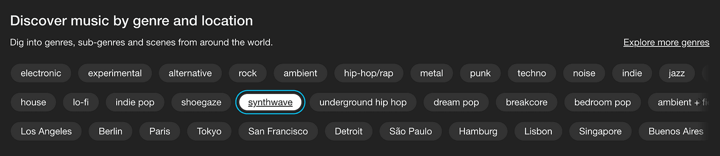
By default, browsers display a blue outline around interactive elements when they receive focus. To optimize a user’s experience and ensure predictability, the indicator must be clearly visible against the background it’s on.
Styling and Contrast
- Color Contrast: Make sure your focus indicator color clearly contrasts with the background so it’s easily distinguishable.
- Border Thickness: Styling focus indicators with at least 2px border thickness is recommended so users always know where focus is on the page.
Proper padding and spacing are also important. If the focus outline gets cut off by adjacent elements (e.g., overlapping margins), users may lose track of where they are in the interface.
Implementing Focus Styles
There are a few ways to style and modify focus indicators via CSS:
:focus— activates when an element receives focus in any way (keyboard, mouse click, assistive tech).:focus-visible— intended to show focus only when navigating via keyboard (or similar), allowing developers to avoid showing outlines on mouse clicks.
Most modern digital experiences benefit from using :focus-visible so focus indicators appear primarily for keyboard and assistive technology users who rely on them for navigation.